

PaceTodo is designed for people who frequently fails in time management and get emotionally affected by delays. By tracking the estimated time and actual time spent, PaceTodo helps users understand how reasonable is the plan and how well they have been executing the plan in real time. Moreover, the feedback system is designed to be caring and supportive when delay occurs.
My friend from Penn, Kim(alias) burst into tears and told me that she failed two CS assignments and missed her midterm. Knowing how smart she was, I was shocked she failed to keep up with basic school work until she showed me her google calendar.

1. Time Management Apps Don't Question Bad Plans: Her plans are too ambitious! She at least needed double the amount of time for things planned, whereas the apps never questioned if she was making reasonable plans.
2. Blame, Shame, and Overwhelming Stress: When Kim experience delays, she blamed herself instead of the unreasonable schedule. Sometimes when Kim couldn't handle the self-blame, she just ran away from her own schedule, which caused not only further delays but also more guilt and shame.
3. Time Management Apps Care About the Tasks, Not You: Following her beaten self-esteem, the app alerts relentlessly reminded her of the deadlines. These apps are perfect for tracking deadlines, but they didn't seem to care about why she didn't keep up.
Kim's story reminded me that there might be many other people who struggle with failed time management. However, Kim's pattern of time management failure might be unique to herself.
To learn more about how people actually affected by delays and how helpful current products were in preventing delays, I designed an online survey with Qualtrics, containing 11 multiple choice questions with free response options. Considering COVID placed greater demands on students' and remote workers' time management skills, I recruited the respondents from graduate students in Penn Graduate School of Education. 52 valid responses were collected . I processed the data with Yi using R and R markdown.
↗ Click to read the full survey design and data reportYes. The findings aligned with my intuition: people experience frequent delays, and these delays could trigger self-blaming, excessive stress and further delays, looping into a vicious cycle.
Among 52 Penn Graduate School Students who participated the survey...
Surprisingly, no. T-tests showed no difference between non-app users' delay frequency and app users' delay frequency. Two possible explanations are revealed: a) insufficient support during task execution; b) insufficient care for users who get emotionally affected by delays.
Non-app users(Mean score = 2.71) and app users(Mean score = 2.68) experience similar level of delays(t(34.2) = .10, p = .92).

Online survey is a good start, but not in-depth enough. So, following the online survey, I conducted competitive analysis together with three in-depth 30-minutes interviews with three survey participants.

Besides time management apps, I also looked into mood journal apps as they provide better emotional support and self-reflection experience. Based on my experience on the apps tested(Emoly, MoodNotes, Reflectly, etc), MoodNotes had the best user experience. So, I did a in-depth case study of MoodNotes.


The interviews focused on why do people delay, what made them think the apps weren't useful, and mapping their user journeys when delay occurred.
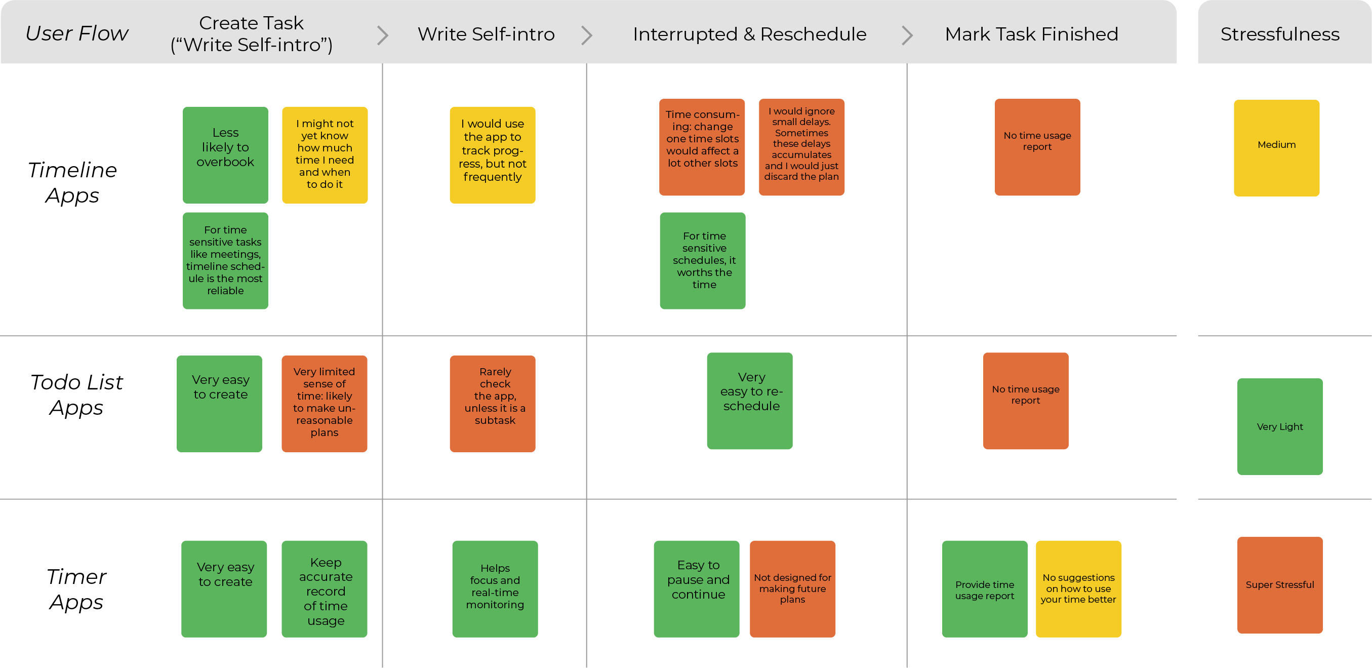
During the interviews, all interviewees suggested that they experienced frequent changes in time management. It could be time consuming to sync these changes with the apps. Moreover, these changes could also increase emotional burden which discourages the user to face delays and adjust plans.

"My plans always change, and none of the apps I use help me to keep track of the changes easily. Especially with Google Calendars, when there are too many changes, it becomes time consuming to update plans. Then I would just lose the plans. "

"I wouldn't say the apps help me make reasonable plans. I always overbook myself and get overly anxious, the apps never disagree. My therapist definitely help me more in this than the time management apps."
Based on the competitive analysis and interviews, I summarized following pros and cons of current solutions:
Especially during the time of COVID, I found three groups face the most time management challenges, and among these groups, PaceTodo's users tend to have 4 shared traits.


As suggested in the research section, current solutions are not good enough. More specifically, they:
(a) Lack execution support: current apps don't provide handy tools to track on-going changes in plans
(b) Insufficient care for users who get emotionally affected by delays
Based on these two key pain points and past research, I set the user persona and two design goals for the new app to be designed:
Having the research insights and design goal in mind, I started to brainstorm and decide the core design strategy. By cross-referencing the design goal and current solutions, I set the core design strategy and started making low-fi prototypes to quickly test the ideas.


The home page(list view) went through three iterations of low-fi prototype designs. The goal was to simplify the user interaction. For example, at first , the user needed to choose a plan date and a due date in "Create a Task " page. In later version, there is a plus button under each day. Not only it reduces the amount of steps for the user to choose plan date, it is also more intuitive process: the user will be encouraged to navigate through the full list of to-do items and understand the existing workload before deciding if they want to add another task to that day.

After the three iterations, the final user flow is structured below for the beta version:

To provide better emotional support, Pacey, the smiley little character is designed.
The color choice, visual style, and logo design are decided based on a quick voting of 14 participants. In future versions, I would like to introduce more warm decoration colors to make the interface more welcoming and friendly.

I spent one and half months learning android development and coding the beta version, and I made this short video as a brief introduction of the main features.


I coded the android version from the ground up. The data structure was closely linked to the user interaction: all data link to "Task".


In June, I started learning Swift and translating the design into the iOS system. Xcode and SwiftUI provides some different tools and features than Android Studio and Java. Some interfaces were therefore redesigned for better user experience on iOS.

For example, the "Create a Task" page is redesigned in iOS since the modal sheet function in SwiftUI is less flexible. Moreover, iOS app designs are generally more rounded than Android ones. I redesigned the interface to better fit the iOS system.


25 users participated in testing the beta version. It is still an ongoing progress. Some users have reported less procrastination, whereas some users figured that they are not procrastinating as much as they thought they were, felt relieved and stopped using the app.

I have been keeping in touch with the app users. As I dug deeper and deeper into their time management failures, I started to realize that the current solution needs more work to truly help more people to manage their time better.
In our research, "disliking the task" was the top three reason why people procrastinated. However, the current solution isn't helping the users to "like" what they do better. In future versions, NLP related technology might be able to help detect users' interest and forms a better solution to trigger users' interest in specific type of tasks.
The algorithm I used to detect user behaviors are quite simple so far. It is capable of capturing the obvious delay trend(e.g. It is already 10:00PM and you still have 4 hours of planned work undone). However, it can be better. For example, the current version only allows users to choose pre-selected delay pattern tags. It would be better if users could enter delay causes in a chatbox and use NLP to capture more precise and personalized delay pattern tags.
The user interaction could definitely get better. For example, when the user create a new task, current solution requires the user to tap a "+" sign and then tap the text field in the modal sheet to activate the keyboard and enter task info. Why not activate the keyboard right after opening the modal sheet?
Kelly(alias), one of the beta version user suffered from chronicle procrastination. She was used to overbooked schedules, daily self-blaming for not finishing her crazy plans, and pushing off deadlines due to overwhelming stress. After digging into her personal story, I realized that instead of another time management app, what she truly needed might be getting rid of her mentally abusive relationship that told her she was worthless, and she should work just work, work, work. PaceTodo fails to help her make healthier schedule as she firmly believed that she should overwork to win her finance's compliment.
Kelly reminds me that many time management failures have complicated context. Of course PaceTodo shouldn't be the one to tell a user to break up with her finance for a healthier work schedule. However, is it possible to link certain delay patterns and delay causes with specific professional service? For example, if "I am overwhelmed and feeling incapable of performing the tasks"is a frequent entry, it might be a sign that the user needs more professional counseling service.
Developing and designing the app at the same time made me realize that in a data-driven product, the biggest challenge is to use the fewest metrics and get the most user data. Some metrics generate more data than the others, and it is important to find the right ones. In PaceTodo, I narrowed down the key metrics to two: estimated time and actual time spent, and I was surprised how much data I could get from observing how users interact with just two metrics. In addition to the time difference, data such as how many times do the user change the estimated time and how many times do the user submit actual time spent are also helpful, and these data could be automatically collected without extra user interactions.